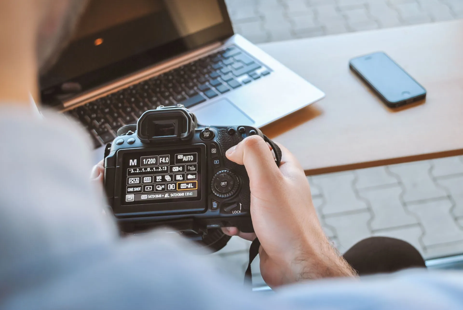
This site started with a frustration. Showing a packaging project is easy: you put the box or the bottle on a table, light it well, take a photo. Showing branding is easy too: there are applications on stationery, signage, vehicles, a visual system you can actually touch. Showing a website is different. Most of the time it ends up as a screenshot that’s smaller than it should be, dropped into a grid next to twenty other identical screenshots.
But the problem isn’t the screenshot itself. It’s that a screenshot doesn’t tell a story. It doesn’t say what needed solving or what changed afterwards. It’s like showing a book by its cover and nothing else. And I wanted to do justice to projects that, by definition, can’t be photographed.
The screenshot is not the project
A website is a system. There’s a content architecture, one or more user flows, a design decision, a set of requirements and technical constraints. The screenshot shows the surface, but not the work. It doesn’t show the video call where the client changed their mind, or the decision to cut a section that was really good, or the bug that showed up in production, or the optimization that took load time from 0.9 seconds down to 0.3.
If I reduce a project to an image, I’m showing the least interesting part. I’m showing the result without the process. And the process is what gives the result its value.
The card as a format
That’s why, for this site — my third attempt at an up-to-date portfolio in more than two decades of doing this work — I chose a card format that combines four things: an image, a name, a description and a status. The image sits inside a browser frame, like a window. That gives it context: it’s not a loose screenshot, it’s a website.
The card also includes the client, the year, the project type and the tech stack. They seem like small details, but they help you understand the work without opening the page. And the status — live, in progress, concept, archived — tells a more honest story than a simple “featured project.” Not every project is finished. Not every project is online. Not every project turned out the way I wanted. Showing that is part of the job too.
The browser frame was a deliberate choice. It tells the visitor: this is an interface, not a poster. At the same time, it sets a limit: the image isn’t trying to be the whole project, just a door (or a window :D) into it.
The case study as narrative
The card is the cover. The project page is the story. That’s where there’s room to explain the starting point, the decisions and the result. You don’t need an essay: three or four sections are enough if each one answers a concrete question.
I like to think of each project as a small case study:
- What was there before. The context, the problem, the frustration.
- What we did. Design and technical decisions, without jargon.
- What happened next. A concrete result, even a small one.
- What I learned. A decision I’d make again… or one I wouldn’t.
The fourth point is the one I care about most: a portfolio that shows learning and evolution.
Fewer projects, better told
Another decision: don’t show everything. A portfolio isn’t an archive. It’s a selection. Six projects told well are better than twenty cards without context.
It also takes pressure off updating all the time. When I finish a project, I ask myself: which image represents it, which story is worth telling, what did I learn. If there’s no story, it doesn’t go in. And that’s fine. Not every project belongs in a portfolio. Some exist to pay the bills, some to learn, some to say no.
The selection is an editorial decision too. It says what kind of work represents me and what I enjoy doing. If you show everything, you’re not saying anything.
The format is a promise
In the end, the card format is a promise: “this is what you’ll find if you come in.” If the promise holds, the portfolio works.
That’s why the site has to be coherent with what it shows. The typography, the rhythm, the way it navigates, the speed it loads. It’s all part of the same message. A portfolio of digital projects that loads slowly or breaks on mobile is saying something, whether it wants to or not.
What I learned making this site
Making this portfolio forced me to look at my own work as a product. I had to decide what to show, what to cut, how to tell each project and what to say about myself. It was uncomfortable. We always say a designer’s worst client is another designer. When that client is yourself, it’s even worse. It’s easier to talk about other people’s work than your own. Obviously.
It also forced me to accept that a portfolio is never finished. It’s a snapshot of a moment, not a biography. What feels like my best project today might be one that no longer represents me in two years. And that’s fine: the portfolio has to be able to change with me.
Next time you have to show a web project, try this: start with the story. What was there before, what you decided, what changed. The image comes later. And if there’s no story, maybe the project isn’t ready for your portfolio yet.